UX/UI Case-study

Libby is a free app developed by OverDrive, Inc. that allows you to borrow ebooks and digital audiobooks from your public library. You can stream books with Wi-Fi or mobile data, or download them for offline use and read anytime, anywhere. All you need to get started is a library card.
Libby works with public libraries that use OverDrive to lend digital copies of books to their patrons. It provides a user-friendly interface and a seamless borrowing experience. Features include the ability to adjust text size, bookmark pages, and even send certain books to your Kindle device. As of my knowledge cutoff in September 2021, the Libby app did not have built-in social networking features.
As a team of three product designers, we found ourselves often getting lost in lengthy chats about our favorite books. We all shared a love for reading that ran deep. One day, amid our bookish banter, we had a lightbulb moment -
why not combine our design skills with our passion for reading?
Our search for the perfect app to revamp led us to Libby, a treasure trove of books but somewhat lacking in the social department. As a lifelong bookworm, I've had countless times where I wished I could quickly ask other readers about a book's pacing or hear from trusted pals before making my pick.
So, we thought,
why not add a social twist to Libby?
This way, readers could not only borrow books but also share thoughts, exchange reviews, and make recommendations. It's all about turning solitary reading into a shared experience, one post at a time.
95% of regular readers would use this feature regularly

To really get to know our readers, I put together an interview guide. I dug into their world, asking about their reading habits, how they stumble upon new authors, and what makes them pick one book over another.
Then, we switched gears and talked about social media -
what they like about it and whether they'd be cool with sharing what they're reading on a social platform.
Finally, we got into their heads a bit, trying to figure out -
what kind of stuff they'd want to post and share on a space that mixes reading and social interaction.

As I immersed ourselves in the initial phase of user research, I unearthed a substantial need among readers: the desire for a trustworthy, engaging community specifically tailored for literary discussions and book recommendations. My participants expressed a longing for a platform that went beyond just providing books, a space where they could converse with like-minded individuals, dive into thoughtful discussions about plot twists and character arcs, and get trustworthy recommendations.
There was a clear gap in the market: an accessible digital environment that seamlessly blends reading with robust social interaction. This insight set the stage for the problem statement and defined the direction of our UX design endeavor.

As I envisioned the networking feature for readers on Libby, I realized the importance of understanding the nuances of user behavior on social media platforms. To deepen my understanding, I plunged into some academic research:

To further ground my research and explore the current landscape, I conducted a comprehensive competitive and comparative analysis. My investigation spanned 16 different platforms, divided evenly between competitors and comparators. While all provided valuable insights, I chose to primarily focus on those that I found most inspiring for addressing the problem at hand. Interestingly, the majority of my competitors lacked the social features I was aiming to incorporate into Libby.
For my comparative analysis, I zeroed in on three main platforms that offered compelling elements I could draw inspiration from:

LinkedIn's Feed offers a fascinating study of how to foster professional networking and meaningful conversation in a digital space. The way content is curated and delivered in the feed can provide useful insights for creating engaging discussions around books in Libby.

The onboarding process of Basmo, with its intuitive and user-friendly design, was an excellent model to follow. A seamless onboarding experience is critical to engage users from the start, especially when introducing new features like social networking.

Goodreads has effectively utilized user ratings to create a robust book recommendation system. It offers a good example of how user-generated ratings and reviews can enhance the decision-making process, a feature that could be valuable for Libby's users.
In my design journey, I knew I had to get a grip on the usual designs and features found in both book-related and social media apps. So, I rolled up my sleeves and dived into a feature analysis of these apps. I kept an eye out for patterns – things like navigation setups, interaction styles, and little bits of UI that seemed to pop up again and again.
I also kept my other eye on those unique, standout features that made each app special. It was like piecing together a jigsaw puzzle, understanding how to blend the familiar and the unique to create an engaging and intuitive user experience.


In this section, I explore the value of customer journey maps as a tool to illuminate the primary frustrations experienced by our users. By charting out the user's path, from initial engagement to eventual book selection, I was able to identify the pain points that lead to an unsuccessful reading experience.
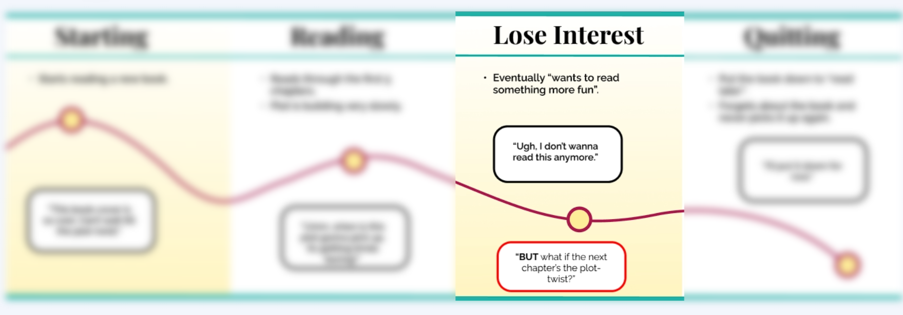
The diagram showcases the the customer journey map of one of the users, Emily Reader, who would like to be able to discuss the pacing of the book she's reading with other readers.
Customer Journey Maps: These maps serve as a visual narrative of our users' interactions with Libby, detailing various touchpoints, user emotions, and potential pain points.

Identifying Frustrations: By analyzing these journey maps, I was able to pinpoint key areas where users may face frustrations. For Emily, her lack of knowledge about the the pacing of the book eventually led to her "putting the book down for later".

what if she's one chapter away from a mind-blowing plot twist that could completely change her view of the book? Suddenly, that book she abandoned could become her next favorite read. I saw Emily's predicament as more than just a problem -
it was a golden opportunity for me to step in and find a way to turn these 'almost' moments into 'can't put it down' experiences.
Following the customer journey maps, I began to bring into focus the individuals behind the journey - the users. Drawing from insights unearthed through interviews and affinity mapping, I created a series of user personas.
I crafted both primary and secondary personas, each reflecting a different facet of my target user base. This wasn't just about demographic data or reading preferences, but about stepping into the shoes of these individuals and truly understanding their needs, frustrations, and aspirations.


Following the creation of user personas, I embarked on a fascinating journey, imagining Libby not just as an app, but a full-scale business.
The starting point was figuring out what actions a Libby user might execute, visualizing the steps they'd take on their literary exploration. I then thought about the people our Libby users would interact with directly, opening the doors to understanding the front-stage characters that breathe life into the user experience.
But no front-stage can run smoothly without a sturdy back-stage.
So, I contemplated the hidden heroes, the back-stage employees, ensuring the front-stage staff have everything they need to serve our users.
However, the backbone of this entire operation comes down to the unseen, yet vital support processes that work silently in the background, ensuring seamless delivery of data and services to all.
Venturing into the world of social media brought along its unique set of challenges. Community guidelines had to be defined and monitored, demanding the need for dedicated monitors operating behind the scenes. These guardians would depend on stringent safety and privacy policies as their compass.
To be prepared for potential obstacles like account hacking or cyberbullying reports, a customer-service panel became an obvious necessity.
But their effectiveness would hinge on a solid training regimen, empowering these front-line heroes with the knowledge and skills necessary to assist our users effectively.
Thus, through this service design blueprint, I uncovered the intricate tapestry of interactions and dependencies that would transform Libby's social networking feature from an idea into a captivating reality.

After laying out the service design blueprint, I found myself brimming with potential solutions for our social networking feature. The challenge was to channel these ideas into something coherent and meaningful.
The answer came in the form of 'How Might We' statements, a design thinking tool that helped me generate a list of focused questions, which I grouped into different categories of concepts.
Two distinct concepts bubbled up to the surface, carving out the direction for my research and design process.
The first addressed the diverse needs of our community. I asked myself, "How might we design a variety of features that cater to varying levels of community involvement?" This question let me explore the different ways users might want to engage with the social aspect of Libby.
The second concept went deeper, challenging a common assumption in social networking design. I wondered, "How might we challenge the assumption that all users want a public feed and explore more private sharing options?" This query pushed me to think beyond the traditional design box, opening up the possibility for a more nuanced social experience on Libby.

After identifying key concepts through 'How Might We' statements, the next step was to make them tangible, translating these ideas into user flows for the Libby app. My focus was on creating intuitive, frictionless paths that would not only meet the users' needs but also enhance their experience on the platform.
Three main user flows emerged as the primary touchpoints in the social networking feature - signing up, leaving a review, and joining a group.
Sign-up Flow: The first touchpoint is the onboarding process. It's crucial to ensure that users can navigate this with ease, as it's the beginning of their journey into the Libby community. To deliver a seamless transition, I asked myself, "What would be the most straightforward route to introduce a new user to this feature, and how can we guide them smoothly through this process?"

Leaving a Review: A key component of the social experience is the sharing and discovery of opinions about the books users read. The challenge here was to design an intuitive flow for leaving reviews, one that not only allows users to share their thoughts efficiently but also piques their curiosity about what others are reading.

Joining a Group: The third user flow is about personalizing the social experience. To cater to the diverse interests of readers, I envisioned a process that guides them on how to join a group. This user flow needed to be clear, engaging, and inviting, nudging the readers to immerse themselves in the community and find their niches.

Stepping right off the trail of our user flow exploration, we dove into the vast ocean of design, turning ripples of ideas into tangible visuals. The goal? To channel the energy of our brainstorming sessions into a series of focused design iterations. Harnessing the power of Zoom calls, Figma, and Google Docs, we breathed life into our collective thoughts.
Each sketch we produced was the result of thorough discussions, a constant back-and-forth of feedback and tweaks. It was like molding clay, gently shaping our thoughts to align with our defined user flows and the needs of our readers.

One such example was the review process sketch. Here, our guiding principle was 'familiarity.' We wanted our users to experience a sense of déjà vu, a subtle 'I've done this before' moment when leaving a review. To foster this, we drafted a design that allowed readers to leave a 1 to 5-star rating along with their opinion - a common practice across various review platforms.

These core components, born in the incubator of our design studio, acted as our north star, guiding us through the successive stages of iteration and towards our final prototype. This was a journey from sketches to wireframes, and finally, to a product that was ready for testing.

Our first significant refinement was to integrate essential app functions into the 'Actions' button, the heart of user activity.
Initially, the design allowed users to leave a review only for a book with an existing review post on their feed - a system that was limiting.
While testing, we realized there was no clear direction for users indicating the 'leave a review' button's location. And what if users desired to review a different book? The situation required adaptability, a broader spectrum of functionality.
During the testing phase, some participants instinctively clicked on the 'Actions' button when they wanted to write a review. Inspired by this user behavior, we enhanced the 'Actions' button to incorporate a drop-down menu listing all primary functions our new feature supported.
Now, users could select 'leave a review' from this menu and navigate through all the books available on Libby to choose their desired book for reviewing.
By evolving the 'Actions' button, we created an anchor point for users, especially those still exploring the app's layout. It's a centralized hub for the main actions, adding simplicity and intuitiveness to the user experience.

Our second major refinement revolved around the media upload feature linked to the review process.
Initially, our design included an 'upload media' option as a clickable text at the bottom of the review screen, intending to allow users to enhance their reviews with photos or videos.
However, during usability testing, it was clear that the media upload feature was not easily discoverable, nor did it appear interactive to the users. Furthermore, feedback indicated that users felt the media upload feature felt obligatory, rather than optional. But what if a user wanted to post a review sans media?
In response, we engineered a solution that brought the media upload option to the forefront yet made it optional. We designed a separate pop-up window that suggested 'upload media', along with a closing cross at the top-right corner. This tweak allowed users to exit if they didn't wish to add media.
By separating the media upload flow, we transformed it from an apparent requirement to an unobtrusive choice, further enhancing the user's sense of control and flexibility.

Our final major refinement involved distinguishing reviews from other posts within the feed.
When users posted a review, our initial design displayed it similarly to other posts, with a focus on the attached media over the review's ratings and text. We reasoned that users could click on "see more" to view the rating and the full review text, thereby maintaining a consistent look throughout the feed.
However, this uniformity proved confusing during usability tests, with feedback indicating that users struggled to distinguish reviews from other post types. The testers pointed out that they primarily used the ratings as a visual clue to identify reviews among other posts. It appeared that by highlighting images in the review, we inadvertently obscured the actual review content.
To resolve this, we redesigned how reviews are displayed. We opted for a unique format that prominently features the rating stars and review text, with attached media minimized. However, users can still click on the images to view them in a larger size if desired.
This adjustment ensures that reviews stand out within a diverse feed, improving user navigation and overall experience.


Currently, Libby's web design essentially mirrors its mobile design, just scaled up to fit desktop dimensions. While this works to some extent, I believe there's immense potential to create a more purposeful and unique desktop experience.
It would be an exciting challenge to re-envision Libby's design specifically for the desktop, ensuring it not only fits the larger screen size, but also capitalizes on the additional space and functionalities it offers.


To keep things familiar for our users, I made sure to use Libby's logo, their typefaces, and brand colors all throughout my design work. This wasn't just about keeping things pretty, it was about making sure that everything felt like a part of the Libby world they already know and love.
I wanted them to feel at home with these new features, just as they do with the rest of the app.


