UX/UI Case-study
Scholist app is a scholarship platform designed to help students discover, apply and keep track of scholarships.
I was delighted to meet with Abidemi, founder of the Scholist app in our kick-off meeting that marked the start of my internship with Scholist.
The Scholist app was aiming to integrate 1 on 1 personalized scholarship recommendations, essay and resume review as well as 1:1 mentorship to help students through the scholarship application process.

The task was to design the Coaches platform that could help students feel supported while navigating the rather complicated world of scholarships.
Our first step was to understand the mission Scholist was trying to achieve as best as we could and articulate the exact goals and expectations that the app had in mind.


Rummaging through the work of the two design teams before us gave us the foundation we needed to start visualizing our own design process. At the end of the design sprint before us in April, the previous design team left us with flows for a student login, dashboard and profile.
To take this progress to the next stage with the new Coaches platform, we were looking at designing the flow for when a student books a coach's services, the new coach dashboard, and the coach onboarding process.
In order to deepen our understanding of Scholist as not just an app, but as a future business, mapping out the business model canvas was an essential step.
It helped us list the fundamental aspects of the business. The task we were assigned to design was a crucial feature to the app as it would be one of the main revenue streams.
Defining aspects like customer relationships and value propositions helped us learn that while we design the feature that earns them money, we would need stay close to the app's core values of helping students.

In preparation for our user interviews We derived a few questions to gain insights from our coach user base.
We needed to understand the needs and concerns of a potential coach who is interested in helping students prepare for their search for scholarships.
Heres how we approached our coaching demographic…

Understanding our student user's needs and concerns was just as important to our design journey. Together we formulated a few different approaches to better understand the students point of view
We also interviewed a student user base

We conduct user interviews during the discovery phase of our design process to learn more about students' experience with scholarships. We also hoped to learn more about the struggles coaches face while mentoring students.
Our findings at this stage of the discovery process set the foundation for the development of our product.
Some Insights:
“I wish I had a resource like this available to me when i was preparing to go to college”
“This app seems easy to use and has a great practical function”


As we began to think about the Coaches platform for Scholist, we wanted to better understand the impacts of coaching on students.
We dove into white paper research and came across this article by Gloria Crisp and Irene Cruz from the The University of Texas at San Antonio that stated the finding that
mentored students show a significantly higher level of academic success and satisfaction compared to non-mentored students.

Another journal we came across was a 2013 journal about the impact of mentoring on academic performances in STEM disciplines.
The journal stated the finding that
mentored students were more likely to persist in their field of study than those without mentors.

Through this research, we learned that for Scholist, 1:1 coaching for scholarships would not only help students submit better scholarship applications but also help them persist in their scholarship search. This would increase the chances of them bagging the scholarships they deserve.


This analysis was very helpful to our understanding of the clients position in the market and can also help to make informed decisions to be competitive and develop a successful product.
Lets have a look at our competitor feature analysis

Using checkmarks we indicated the existence of the listed features across all 7 Scholarship platforms. Through this analysis, We learned about some standard practices, and were able to identify that with personalized mentorship,
Scholist would have a major competitive edge over its competitors.


Following our 9 interviews, we collectively gathered 12 insights from over 150+ data points.
We uncovered two main themes

Across the coach interviews, it was said that they would appreciate frequent communication from the student. An increase in communication would help them better personalize their coaching to the student.
Similarly, all students expressed that 1:1 attention from a mentor helps them build focus and feel supported. It was also apparent that there was a need for order-based services like essay reviews, application help, etc.

This led us to one of our primary customer journey maps.
Customer journey maps helped us follow a user's journey in order to identify points of conflict. Knowing where these points of conflict occur helped us visualize how Scholist could help resolve them.

This is what his user journey looked like.
He starts out with a strong aspiration to specialize in neurology. He begins searching for scholarships that aligns with his medical career goals. As he delves deeper into the scholarship search and application process, he starts feeling overwhelmed by the complicated application requirements.
He then discovers his ideal support system, a platform that connects students with scholarship coaches. He finds a highly rated coach, but they don't align with his needs and he wants a more personalized mentorship.
He perseveres and finally connects with a coach who specializes in scholarships for medical students. With the right coach and support system, Lucas feels empowered and is ready to start his new journey in Neurology


In Lucas' journey, the turning point would be, getting personalized coaching, exactly what Scholist aims to offer with the new Coaches platform.
Next, we ideated on multiple customer journey maps that we could identify through user interviews and affinity mapping.


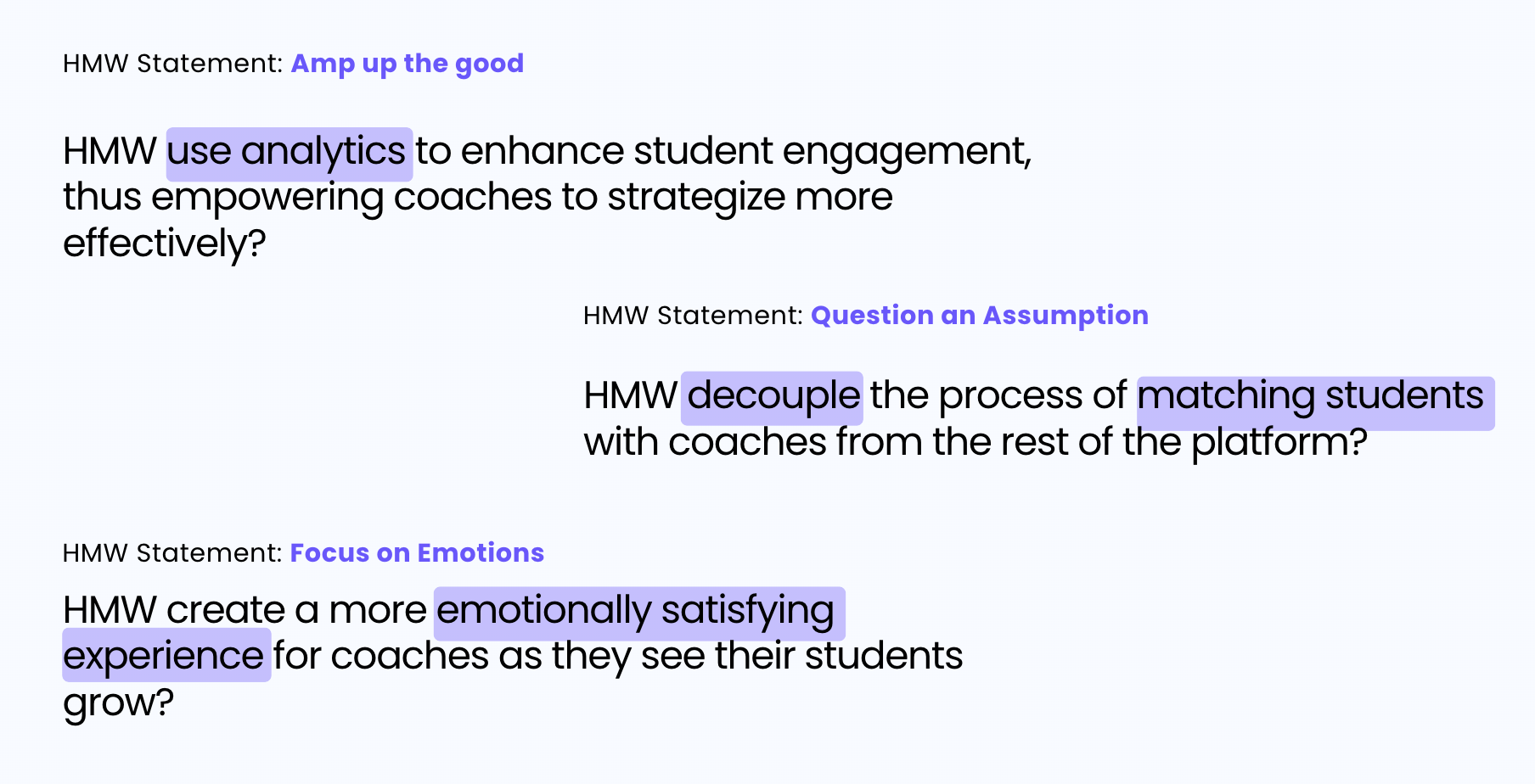
To gather ideas on the kind of solution for our coach booking we produced a list of potential How Might We statements applied to different concepts. Afterwards, we found three distinct concepts to apply to our research and design process.
By breaking the point of view into pieces, for the coaches we asked:
"How might we create a more emotionally satisfying experience for coaches as they see their students grow?"
We also wondered,
"How might we decouple the process of matching students with coaches from the rest of the platform?"
Building on our customer journey maps, we then imagined Scholist as a full-scale business.
We listed all central actions a Scholist user could execute.Then we listed all the people that any Scholist user would come into contact with directly. This allowed us to think about the back-stage employees that the front-stage staff may rely on.
And finally, the support processes that work in the background in order to provide essential data and services to all other employees. This Service design blueprint helped us realize the real-life implications of us adding this new feature to Scholist


With user research underway, we began the design process that included creating the user flow of a student booking a coach for their service.
This flow follows the student as they browse coaches, view their profile and book a session with their chosen coach.
We also needed to create the user flow of a coach signing up to be a coach on our platform. This follows the coach through the application and profile setup.


After we conducted our user research, we were flowing with ideas. We decided to channel and focus those ideas into a design studio.
To execute these ideas, we collaborated through Zoom calls, Figma, and Google Docs. With each sketch, we discussed what we liked most and what we felt would be most suitable to our user flows and to the needs of our students and coaches.
While collaborating, we made a conscious effort to design screens that could use the components from previous group sprints.

Stage 4 brought to life our visions that we created through sketching and wire framing.
We sat on long zoom calls and designed together. We collectively browsed and decided the content that would represent the high-fidelity prototype.
With our prototypes ready, we headed into conducting valuable usability testing.

We gathered valuable feedback from users to evaluate the platforms user-friendliness and effectiveness. Overall, the response form our participants was positive, highlighting several strengths as well as some areas in need of improvement.
This was based on the various feedback we received through multiple usability tests done with 5 of our student/coach users.

The first major improvement was the simplification of the calendars availability indicators.
It was hard for users to differentiate between which dates the coach was and was not available.

We resolved this issue by adding a simple green dot under available dates. This was in pattern with the green dots showcasing the available times.
Additionally, with the unavailable dates greyed out, it was much easier for the user to identify the dates that were available.


Throughout our development process, we met with Abidemi after each iteration was completed to get our designs reviewed. This helped us verify that we were designing close to Abidemi's vision.
Before we finalized our clickable prototype, we ended the first major developing phase with 3 versions of our app.

While curating the slides for this presentation, we revisited our user research deliverables as a group. We discussed the various edge cases we came across while conducting user interviews and making our affinity mapping classifications.
If we had more time, we would want to experiment with designing a version of this new feature that has a parental portal. Keeping students in mind who may have unique challenges, we realized that the platform would benefit from an option for the parent to login as proxy for the student to aid them in their efforts to find appropriate scholarship opportunities
We would also like to try the addition of a reward system such as Karma points, to provide users with an incentive to engage with the platform as much as possible.
Lastly, with a platform that connects coach services to the student customer base, having a customer support system would be important.

Scholist's current web design is the desktop visual design scaled down to fit the responsive mobile size; Upon completion of our iterations and feedback from usability testing, we have some final design options for mobile display.
For the mobile version, we scaled up the main features. We got rid of some of the text and kept just the icons. This would make important features more visible to the mobile user, as they are likely to rely on the familiarity of the icon rather than the text.

It was an intriguing design challenge to think about what features needed to be prioritized in the mobile version of the screens.

Bringing this exciting design sprint to an end, we curated a product evolution canvas. This canvas helped us envision what scholist looked like now, at the end of our design sprint.
And, also helped us visualize the full potential it could reach in the future.
The minimal viable product that we delivered designed the integration of the Coaches platform. Future design sprints could include the integration of the Community feature. This would foster collaboration between and amongst coaches and students.
We also discussed that Scholist could reach new heights and add another competitive edge if they explored having exclusive scholarships and events on the app.
With an undeniable competitive edge with personalized coaching, Scholist is bound to set new standards in helping students get their dream scholarships.


